Cheeky Charts


Let's get serious for a moment. What if you need to illustrate something more boring, like a budget or something?


That's where my graphs and charts come in. They can get across a complex idea in an eye-catching way. For example, if you want a bar graph to show how much your soccer team has been spending on equipment over the past few years, I can do that...


Adding a chart
To add a chart to any slide, click the Chart button in the Illustrations Group in the Insert tab.

Some slide AutoLayouts have placeholders for charts. To insert a chart into one of these layouts, just click the chart placeholder.


Note: You can also import an existing chart you've already made in another program or earlier version of PowerPoint. When it's imported, it will need to be converted into the PowerPoint 2007 format if you want to change any of its data or formatting. PowerPoint 2007 will ask you this when you try to change any formatting or data.


When you insert a chart, a sample bar chart will appear on your slide. At the same time, Excel 2007 opens in a split screen with the corresponding sample data worksheet.

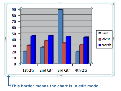
You will see sample data in the first four columns. The bars in the chart are the graphical representation of the numbers in the data sheet. Notice how a higher number in the data sheet results in a taller corresponding bar.


To create your own chart, you can replace the data in the sample data worksheet with your own. Try adding a number to the chart to see how it changes the corresponding bar on the chart.

    1. In the data worksheet in the Excel 2007 window, click in the first row of column A.

    2. Type in the number 50, then press Enter. The corresponding bar on the chart increases in height.

    3. Try adding other numbers into the data worksheet to see how they affect the bars.


Using the tabs tip


After you've finished entering data, click on the Microsoft Office Button on the Excel 2007 side of the screen and select Save As. In the Save As dialog box, select a where you want to save the worksheet. Then give the worksheet a name in the File name box. Click Save. Finally, in Excel, click it's Microsoft Office button again and select Close. You're left with your updated chart in your PowerPoint slide.

If you need to make any revisions to the chart data, click the chart to select it, then click on the Design tab that appears along with Chart Tools contextual tool tab. In the Data group, click on the Show Data button. Excel 2007 will open again in a split window with a worksheet containing all the table's data. Edit the appropriate cells and save. The changes made will appear in your chart.


Suppose I'm doing a chart on how our show is rated compared to the other talk shows. If I need to add a new show, can I do that?


You sure can. You can also delete information. You know, for those times when your competitors' shows are cancelled due to a lack of viewers.


Oh, Power, you're such a sweet talker.


Adding and deleting information
The default chart has four sets of bars, and its data worksheet has four columns of information filled in. What if your presentation requires more than four columns/bars? It's simple. Fill in additional columns on your data sheet.

    1. Go to the next empty column on the data worksheet and click inside a cell. Type the numbers 50, 60, and 70 in the first three rows.

    2. Notice how a new set of bars appears in the chart.


You can also remove columns or bars from your data worksheet and chart. Here's how you do it:

    1. In the Excel 2007 side of the screen - the data worksheet is open - click a table cell in the column or row that you want to delete. For example, Column D.

    2. Click on the Table Tools tab of Excel's Ribbon and then click on the Layout tab. Go to the Table Group. Click the downwards arrow of the Select button. Choose the Select Column (or Row) button.

    3. Now go to the Rows & Columns Group which is also in the Layout tab. Click on the downwards arrow of the Delete button.

    4. Click the Delete Columns button. Column D is now removed from the data worksheet and the corresponding bar also disappears from the chart.

Note: If you just want to delete the data from an entire column or row, not the actual row or column, simply select the data in the column or row and then hit the Delete key on your keyboard.


Change how your chart looks
To make any formatting changes to the chart, click anywhere on the chart to select it. A light green frame-like border will appear around the chart.

Chart in edit mode

When a chart is selected, the Chart Tools contextual tool tab automatically appears. Click on this tab to make it visible.

Chart Tools tab

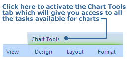
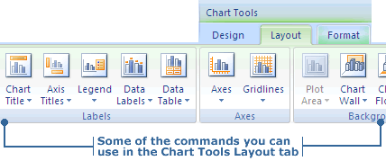
The Chart Tools contextual tool has 3 of its own tabs: Design, Layout and Format. Everything you could possibly want to alter in a chart is available in these 3 tabs from adding a title to your chart to picking out a color style.

Some Chart Tools' commands


Does it have to be a bar chart? What if I want to change it to a pie chart?


No problemo.


Speaking of pie charts, I'm getting pretty hungry. I know an all-night diner we can hit after the show. They have the best apple pie...


Changing the type of chart
The default chart in PowerPoint is a bar chart. If you think your information would be better as a different type of chart, you can change the chart type.

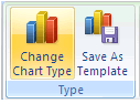
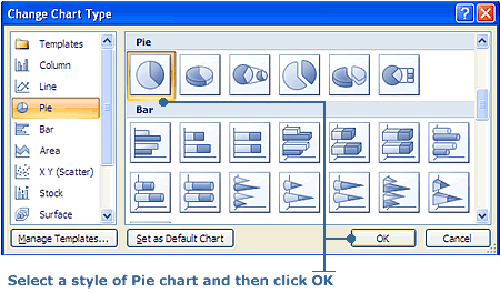
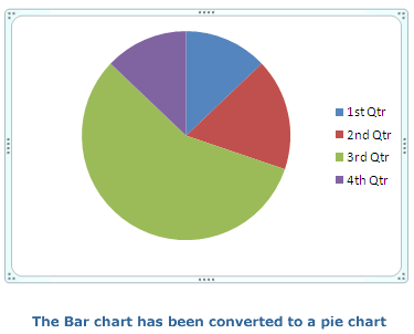
The following steps show you how to convert the bar chart to a pie chart:

    1. Click the chart you want to change. A light green frame-like border will appear around the chart. Click on the Design tab underneath the Chart Tools tab.

    2. In the Type Group, click on Change Chart Type. The Chart Type dialog box appears.

Chart Menu

    3. In the Chart Type list, click Pie, and you will be shown the Pie chart styles you can choose from. Select a style and then click OK. The information in your data sheet will now be displayed in a pie chart.

    Pie chart style options

    Pie Chart


Those charts sure bring numbers to life.


Yes, it's much easier to see relationships between numbers when they are in a picture form.


Hey, do you have anything to make a list exciting? Make my album list as hot as the artists sound?


You bet. It's called a SmartArt graphic. You use them to add life to your lists, see relationships between ideas, organize your thoughts, or create flow for a project's outline.


Wow, it's gotta be really smart if it can organize Jim's thoughts.


Adding a SmartArt graphic
Lists too boring? No one's paying any attention to what you're trying to convey? Then you can make people take notice by changing ordinary text into a SmartArt graphic.

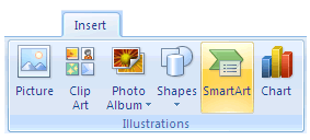
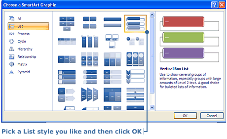
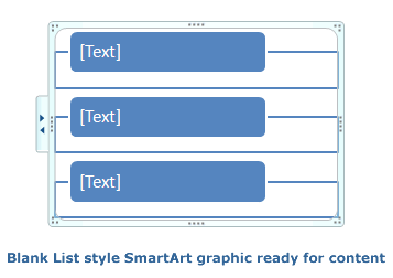
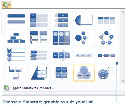
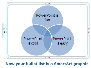
As a chart is used to transform numeric data into a visual aid, a SmartArt graphic does the same thing for text such as lists. A SmartArt graphic can be simple or complex. SmartArt offers a wide range of shapes, designs, layouts and color schemes. Of course, if you don't like an element of a built-in SmartArt graphic, it's color scheme for example, PowerPoint makes it easy for you to do changes.

You can convert existing text on a slide into a SmartArt graphic, or you can pick a SmartArt graphic first and then add your text to it.

Follow these steps to create a List style SmartArt graphic for your slide.

    1. In the Illustrations Group in the Home tab, click on SmartArt. The Choose a SmartArt Graphic Dialog box will appear.

SmartArt graphic

    2. The list on the left is all the SmartArt types you can choose: List, Process, Cycle, Hierarchy, Relationship, Matrix and Pyramid. We're doing a list, so click on List. The List styles you can choose from will be shown in the middle area of the dialog box. When you select one, a description of it will be given in the right hand area.

SmartArt graphic dialog box

    3. Choose a List style and then click OK. The SmartArt graphic is added to your slide.

Empty List Style SmartArt graphic

    4. You'll notice that the SmartArt graphic is already selected; there's a light green frame-like border around it. You can now add your text. You can click on [Text] and start typing, or you can click on the arrows on the left side of the border to open the Text Pane. With the Text Pane open, click on [Text] and start typing. When done, click on the X to close the Text Pane.

Add some text

Text added

    5. Have more points in your list than you do boxes? Adding more is easy. With the Text Pane open, place your cursor at the beginning of a bullet and hit enter. A new box is added above. If you place your cursor at the end of a line of text and hit enter, a new box is added below.

    New text box added


Add your style to the SmartArt graphic
You now have a SmartArt graphic with your text entered into it on your slide, but it's still rather plain looking. With the tools available, the only limit to what it can look like is your imagination.

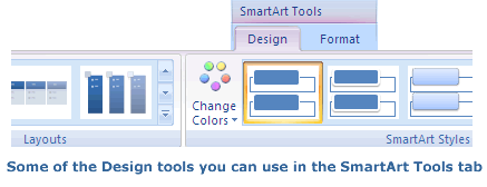
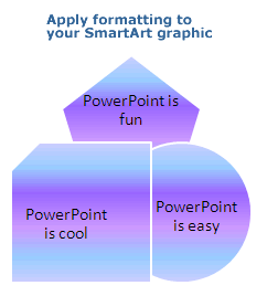
Whenever the SmartArt graphic is selected, the SmartArt Tools contextual tool appears with its 2 tabs on the Ribbon: Design and Format. You use the SmartArt Tools to make all your formatting and style changes.

SmartArt Tools

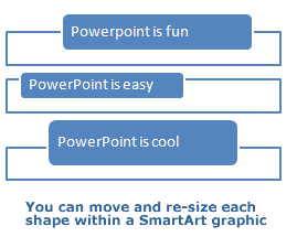
Just as you've done with shapes and text boxes already, you can move and re-size the SmartArt graphic. What's a little different though, is that you can even move and re-size the individual text shapes within the SmartArt graphic too. It's done the same way. You click on one of the text shapes to select it. The dashed border with re-sizing handles appears. Now you can re-size or move the text shape. To make precise changes in size of a shape or the whole SmartArt graphic, there is the Size tool in the Format tab you can use.

Alter the Size of the SmartArt graphic


Note: Since a SmartArt graphic is made up of shapes, you can apply all the tools used with a shape: Shape Fill, Shape Outline, Shape Effects and Change Shape.


To quickly alter the color and style of a SmartArt graphic, use the SmartArt Styles and Change Colors tools in the Design tab. There are lots of built-in color themes and styles to choose from. With the tools in the Format tab in SmartArt Tools you can change a built-in color theme or style to create exactly what you want.

Add a color theme and style to SmartArt

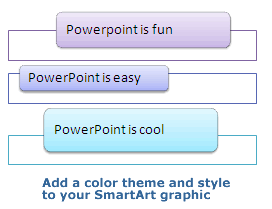
You can also change the format of the text using the Font Group in the Home tab, as well as how it looks by using the tools in the Format tab in SmartArt Tools: Text Fill, Text Outline, Text Effects and WordArt.

Change the formatting of the SmartArt even more

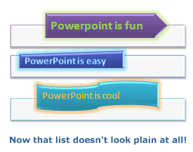
Finally, you might decide the layout you originally chose isn't quite right. In the Design tab in SmartArt Tools, go to the Layout Group. Click on the downwards pointing arrow and all the layout options will appear. As usual, hold your mouse over a layout to see an instant preview on the SmartArt graphic. Click on a layout and it will be applied.

Change the layout of the SmartArt


Convert existing text to a SmartArt graphic
Converting text you already have, such a bullet list, to a SmartArt graphic is simple to do.

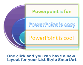
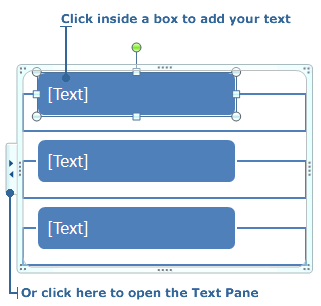
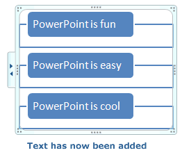
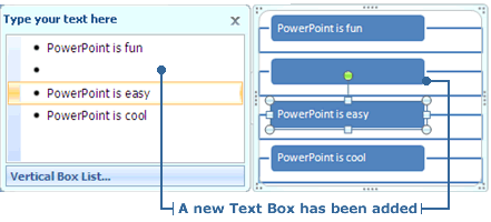
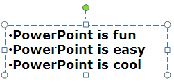
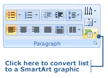
Follow these steps to change a bullet list to a SmartArt graphic:

    1. Click on the list to select it.

Select the Bullet List

    2. Click on the Home tab if you are not already there. Then, in the Paragraph Group, click on the icon in the bottom right corner. This is the Convert to SmartArt Graphic tool.

Convert to SmartArt Graphic tool

    3. When you click the Convert to SmartArt Graphic tool, you are given a selection of SmartArt graphics to choose from in a drop-down window. Hold your mouse over a layout to see an instant preview of how your list will look as that SmartArt graphic. Click on the layout you want, and it will be applied. If you want more SmartArt to choose from, click More SmartArt Graphics at the bottom of the window and the Choose a SmartArt Graphic dialog box will open.

Select a SmartArt Graphic

Bullet list is now a SmartArt Graphic

    4. Your list is a SmartArt graphic. Now you can use the SmartArt Tools to format the graphic to how you want it to look.

Apply formatting to the SmartArt Graphic


Amazing as ever, Power. My album list will dress to impress if I use one of your SmartArt graphics.


Thanks, Jim. Wait to you see how I can transform an ordinary table.


Back
Quick Quiz
Next