Cheeky Charts


Let's get serious for a moment. What if you need to illustrate something more boring, like a budget or something?


That's where my graphs and charts come in. They can get across a complex idea in an eye-catching way. For example, if you want a bar graph to show how much your soccer team has been spending on equipment over the past few years, I can do that...


Adding a chart
To add a chart to any slide, click the Insert Chart button on the Standard Toolbar.

Adding a chart button

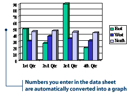
When you insert a chart, a sample data sheet and corresponding bar chart will appear on your slide. PowerPoint has included some sample data in the first four columns. The bars in the chart are the graphical representation of the numbers in the data sheet. Notice how a higher number in the data sheet results in a taller corresponding bar.

To create your own chart, you can replace the data in the sample data sheet with your own. Try adding a number to the chart to see how it changes the corresponding bar on the chart.

    1. On the data sheet, click in the first row of column A.

Selecting a cell

    2. Type in the number 50, then press Enter. The corresponding bar on the chart increases in height.

Change in graph height

    3. Try adding other numbers into the data sheet to see how they affect the bars.

Note: Some slide AutoLayouts have placeholders for charts. To insert a chart into one of these layouts, just double-click the chart placeholder.


Using the tabs tip


After you've finished entering data, exit the work window by clicking anywhere outside the chart or the data sheet. The data sheet will disappear.

If you need to make any revisions to the chart, double-click the chart and the data sheet will appear again.

If the data sheet doesn't appear after you double-click the chart, click the View Data Sheet button on the Standard Toolbar.

View Data Sheet button


Suppose I'm doing a chart on how our show is rated compared to the other talk shows. If I need to add a new show, can I do that?


You sure can. You can also delete information. You know, for those times when your competitors' shows are cancelled due to a lack of viewers.


Oh, Power, you're such a sweet talker.


Adding and deleting information
The default chart has four sets of bars, and its data sheet has four columns of information filled in. What if your presentation requires more than four columns/bars? It's simple. Fill in additional columns on your data sheet.

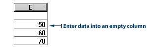
    1. Go to the next empty column on the data sheet and click inside a cell. Type the numbers 50, 60, and 70 in the first three rows.

Entering data

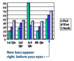
    2. Notice how a new set of bars appears in the chart.

New bars in the chart

You can also remove columns or bars from your data sheet and chart. Here's how you do it:
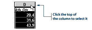
    1. Click the column heading of the column you want to delete. For example, Column D.

Selecting data to delete

    2. Click the Edit menu, then click Delete. The data disappears from the column and the corresponding bars disappear from the chart.


Does it have to be a bar chart? What if I want to change it to a pie chart?


No problemo, muchacha.


Speaking of pie charts, I'm getting pretty hungry. I know an all-night diner we can hit after the show. They have the best apple pie...


Changing the type of chart
The default chart in PowerPoint is a bar chart. If you think your information would be better as a different type of chart, you can change the chart type.

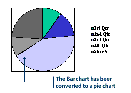
The following steps show you how to convert the bar chart to a pie chart:

    1. Double-click the chart you want to change. A heavy border appears around the chart, and the data sheet appears.

    2. Click the Chart menu, then click Chart Type. A Chart Type dialog box appears.
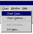
Chart Menu

    3. In the Chart Type list, click Pie, and then click OK. The information in your data sheet will now be displayed in a pie chart.

    Pie Chart


Back
Quick Quiz
Next