|
Changing your font
1. Click anywhere on the text. The text box becomes selected with the resize handles and dashed border showing.
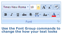
2. In the Home tab, the Font Group now becomes active.
3. Click on a Command button, like B for Bold, in the Font Group and it will be applied to all of the text in the selected text box automatically. To use some of the Command buttons, you need to click the arrow beside them to see the options available, such as the Font Color and Font Size buttons.
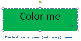
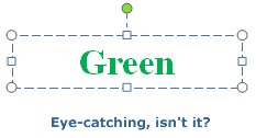
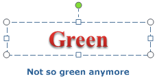
4. Try clicking the Bold button, then try changing the size to 36 and the color to green.
All the text in your text box is now green, bolded, and a font size of 36.
If you don't like the changes you've made, you can remove all the formatting - make the text plain again - by clicking the Command button in the top right of the Font Group.
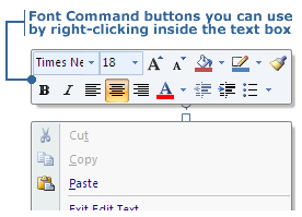
Note: There are 2 other ways you can access the Font Command buttons. The first way is to right-click on your mouse once the text box is selected. The formatting menu will appear. Only the most commonly used Command buttons are available here though.
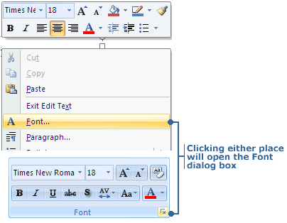
The other way is to use the Font dialog box. You can make all the font changes you want to do within the dialog box and then click OK to apply.

To open the Font dialog box, click on the little box with the downwards pointing arrow inside that is found in the corner of the Font Group in the Home tab. Alternatively, you can select the Font option in the Formatting Menu when you do a right-click within the selected text box.
Add special effects to your text
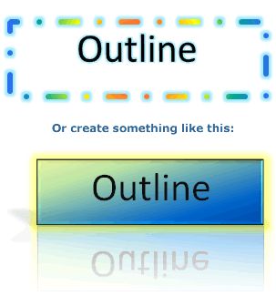
Just as you can add effects to your text box, PowerPoint 2007 has effects you can add to your text too. When you click on text, the text box it's in becomes selected. As you saw in Whizzy Words, when selected, the Format tab appears along with the Drawing Tools. Click on Format or Drawing Tools and among the activated Groups you'll see one called WordArt Styles. This is where the text effects are.
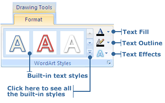
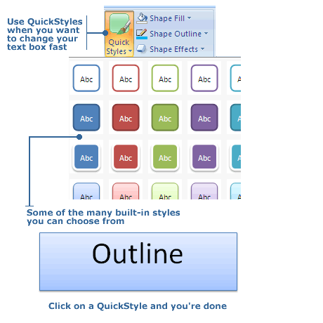
The three large letter A icons in the WordArt Styles Group is where you go to quickly apply a built-in text style. Click on the downwards arrow to see all the built-in types. Holding the mouse over one will give you an instant preview on the selected text. Click on one to apply it.
In the area on the right in the WordArt Styles Group are 3 smaller A icons. They have similar functions to the 3 Shape buttons in the Shape Styles Group that was covered in Whizzy Words.
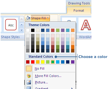
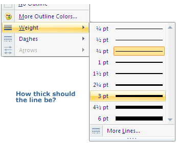
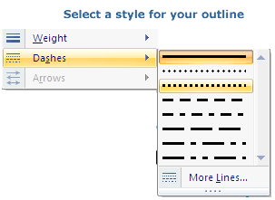
The top right one is Text Fill which lets you apply a solid color, gradient, picture or texture to your text. The middle button is Text Outline which lets you specify the color, width, and linestyle of the outline of your text.
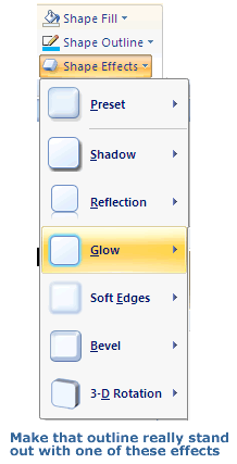
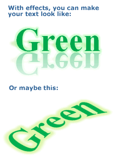
The last button is the Text Effects button. Click the arrow beside Text Effects and a drop-down menu will appear. You can apply one or more of these neat effects: Shadow, Reflection, Glow, Bevel, 3D Rotation, or Transform.
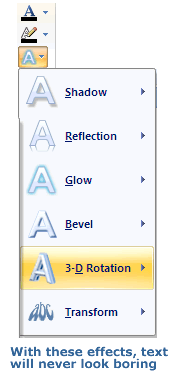
Select any of these options and you will be shown a bunch of choices. As usual, holding your mouse over one will create a preview of it on your selected text box. Click on an effect to apply it.
Note: You can access all the options in the Text Fill, Text Outline and Text Effects buttons in a single dialog box. To open the Format Text Effects dialog box, click on the little box with the downwards pointing arrow inside that is found in the corner of the WordArt Styles Group.
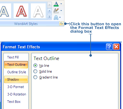
The Format Text Effects dialog box is also where an advanced user can further adjust the properties of a given text effect such as it's distance, transparency and angle.
|