![]()

|
![]()
|
|
PowerPoint Pretty
Frugal Fonts
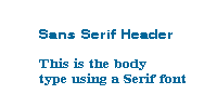
If a presentation contains a lot of text, it's good to use a font such as Times New Roman, which is known as a "serif" font. A "serif" is a small, decorative mark that finishes off the stroke of a letter. There are also other fonts called "sans-serif" - which means: without serif. "Sans" - as you may recall from French class - means "without." In general, it is easier to read a large amount of text when a serif font is used. Sans-serif fonts also tend to create a more casual, less-formal impression.

Designers often recommend using font styles that contrast with headers from the rest of the text. A common practice is to use a san-serif font for the header and a serif font for the body - for example: Helvetica for the header and Courier for the body.
If you want to use different fonts within the same presentation, it's best to keep it down to only two or three. Using a smaller number of fonts will keep things orderly; too many different types may make it all a bit too chaotic. Like so many things in life, you'll just have to experiment before you know what works best. When you are trying to decide which fonts to use, consider how they will look on screen. Some fonts - like Verdana - tend to look better on a computer monitor. Other fonts are more suited to print. Think about which method of presentation you will use and test your font in that medium to see if it is legible. Is it visible on a computer screen or digital projector? Does the font still look good when your presentation is printed out?
Tasteful Tiles
It's good to choose a high contrast between text and background colors. For example, black text on a white background is most legible. Other good combos include white text on a dark blue or purple background - or dark blue text on a yellow background. If you want to use backgrounds, avoid patterned ones. It's best to keep the background pattern as subtle as possible. Some patterns make it very difficult to read text - and we doubt you want to make your audience dizzy or nauseous.
To spell check or not to spell check
The advantage to not using spell check is that it forces your students to be more careful about their spelling. The spell checker can often be a crutch that allows people to develop poor spelling habits, and that's just no good. Ultimately, however, the choice is up to you! |
![]()
|
|