|
Classroom Set-Ups
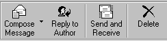
With so many options available for customizing the Outlook Express window, you might not know where to start. That's why we've put together this list of Outlook Express set-ups that work well with kids. Choose your favorite, or use them all--it's up to you. Use It or Lose It With younger students, the fewer buttons and items to click the better. A simple way to do this is by removing unnecessary buttons and toolbars. For example, if you know that your students won't be using the Address Book, then remove the Address Book button from the toolbar. A few of the toolbars have the same function as other display items. Take for instance the Outlook Bar, the Folder List and the Folder Bar. All three give you access to folders, but each is presented in a different way. Thus, having all three items visible may be redundant. Which of the three display items should you use to access folders? That comes down to personal preference. However, if your students are only using Outlook Express for basic sending, receiving and reading of mail, we recommend keeping the Folder Bar. This keeps the items that your students can click on to an absolute minimum. Yet, allows easy access to folders should you need them. Ordered Buttons You can also move the buttons on the toolbar so they appear in the same order that your students will use them. For basic e-mail, consider the following set-up for the toolbar:
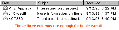
Pretty Previews Here's a "Cliff Claven" factoid. Wide bodies of text are more difficult to read than narrower ones. You can see for yourself by moving the Preview Pane in Outlook Express to different locations. If you position the Preview Pane below the messages, you will have a wide window with long lines of text running from left to right. If you position the Preview Pane beside the messages, you will have a narrower window with shorter lines of text from left to right. Font size also contributes to legibility in the Preview Pane. The larger the font, the wider you should make the Preview Pane. You can do this by simply clicking and dragging the gray divider between the message area and the Preview Pane. See if you can adjust the Preview Pane so that there are, on average, 8 to 11 words on one line of text. This length is considered optimal for reading. Clean Columns More food for thought. The more columns you have for your message list, the more likely that you'll be scrolling from left to right. This doesn't sound like a big deal, but remember--as your message list grows you will also be scrolling from top to bottom. A viewing area that moves in four different directions is always more confusing than an area that only moves in two. What's our point? Remove any columns that you don't use. For most classrooms, the From column, Subject column and Received column provide enough information for basic e-mail. |